When the redesign reached the About page, I rejected both versions of the copy. I liked one of the single-column layouts, but the writing had drifted from what I wanted. My feedback at the time was: “Neither works. The content has drifted from the original brief.”
I did not want to share much personal information or turn the page into a résumé. I kept the single-column layout I liked and had the introduction rewritten: out went the city, school, dates, and personal history, leaving my nickname, a short introduction, current work, and public projects. I then asked to add a public email address and GitHub so readers had somewhere to continue the conversation.
The homepage now has just a name, a verse, and three links: About, Work, and Writing. A deer stands on the left, a crane on the right, and the period in lennney. is orange. Before reaching this version, I tried a dark design called Signal, an engraving-inspired direction, and dot-matrix compositions. The illustrations and inner pages went through more changes after I chose the paper direction.
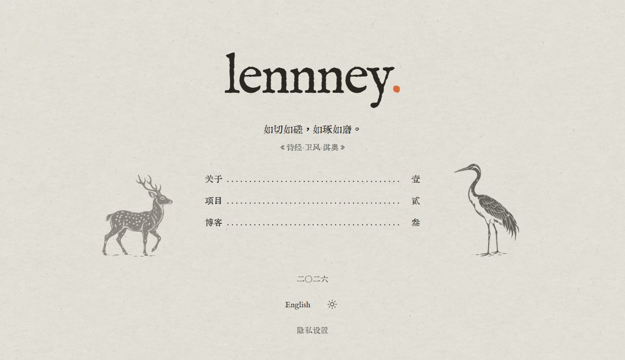
The deer and crane face the contents, with orange reserved for the period in the wordmark.
From a technical workspace to engravings and dot matrix
The Signal direction from July looked more like a technical workspace: a dark outer frame, a cool white reading area, numbered rails, fine lines, monospaced type, and occasional orange accents. Projects appeared as entries in a register, but the abstract calibration graphics beside them did not explain what they did. Similar rows appeared on About, Work, and Writing. Different kinds of content had ended up looking too much alike.
The engraving-inspired design I tried in early September looked quite different. The initial “Mountains and Seas Notebook” combined fine Western-style engraving, Chinese mountains and cloud motifs, and a beagle character. The main illustration later became “Reading a Map Above the Clouds”: a beagle sitting on a cloud, studying a map whose unrolled paper turns into a mountain.
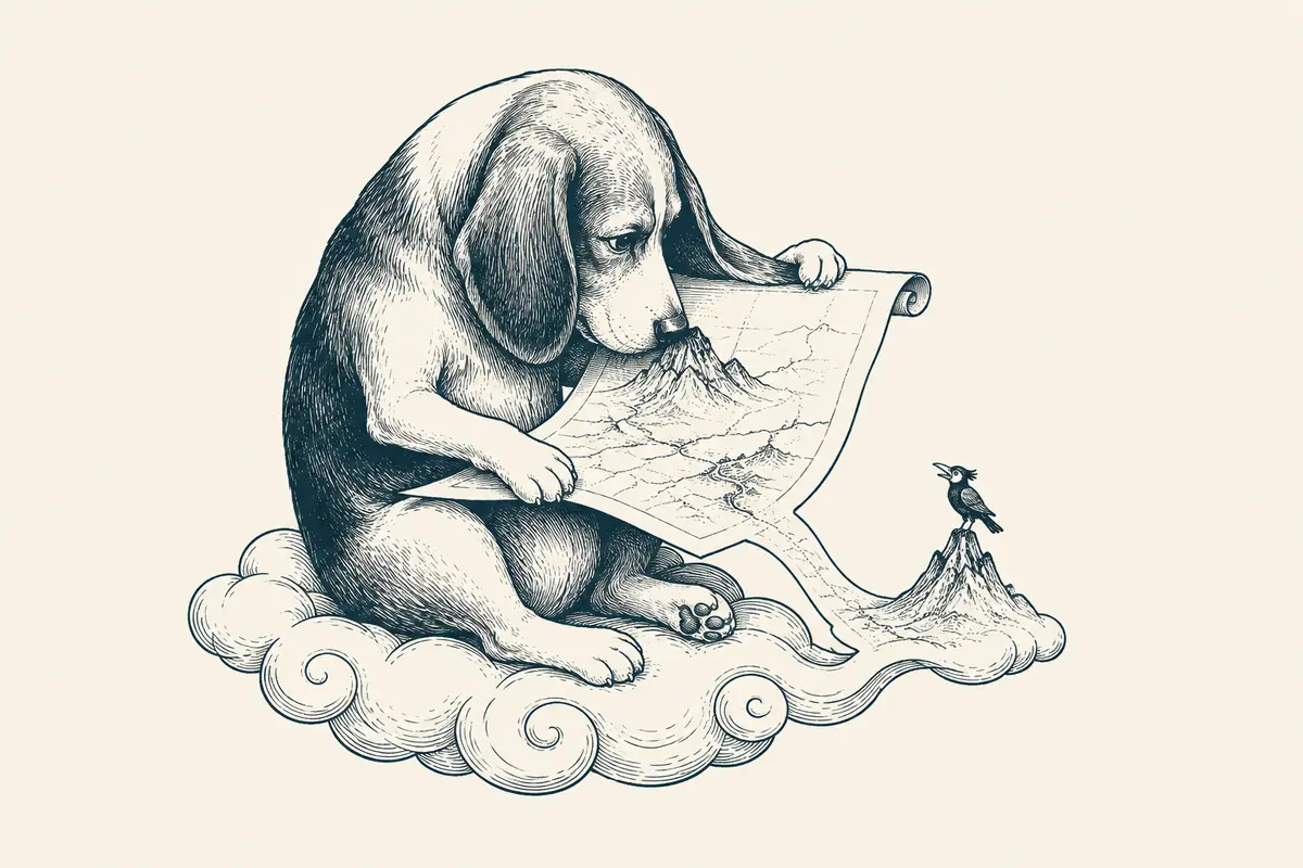
“Reading a Map Above the Clouds,” the beagle illustration from the engraving phase.
That version paired warm paper tones with blue ink and grouped the content in a two-column desktop layout. Each of the four projects had a beagle illustration with a different action, now related to what the project did.
The engraving phase went through several revisions. I initially used typewriter lettering with Chinese Song-style type, then tried EB Garamond and Song-style type for the body, keeping the typewriter face for dates, numbers, and other supporting text. The page-turning experiment was dropped, and the page kept continuous scrolling. Stamps, crop marks, simulated folded corners, and geometric ornaments also came out.
At that stage, I explicitly asked for no paper texture or full-screen noise. The paper texture visible today came from a later experiment.
In mid-September, I tried two dot-matrix compositions. I chose neither and asked to return to a simple lennney., my actual avatar, a personal introduction, and links to the blog and real projects. The next candidates used paper white, ink-colored text, and orange. Large project and article lists on the homepage became a few introductory paragraphs with links within the sentences.
Testing the type with real articles
The later paper direction drew on Lynn Fisher’s 2025 website refresh. In her case study, she describes the influence of paperbacks: a homepage like a table of contents, chapter-like headings inside, and a subtle paper texture.
On my own site, the first task was to work out the Chinese and English typography. Chinese headings use Huiwen Mincho and English headings use IM FELL English; body text uses Noto Serif SC and Alegreya respectively. Code keeps a monospaced face. The headings could have a pronounced printed character, while the body needed to hold up over a whole article.
So I tested the type with passages from existing articles. In the specimen, I could read a heading followed by a paragraph, check how English terms and numbers sat within Chinese text, and see whether emphasis looked jarring.
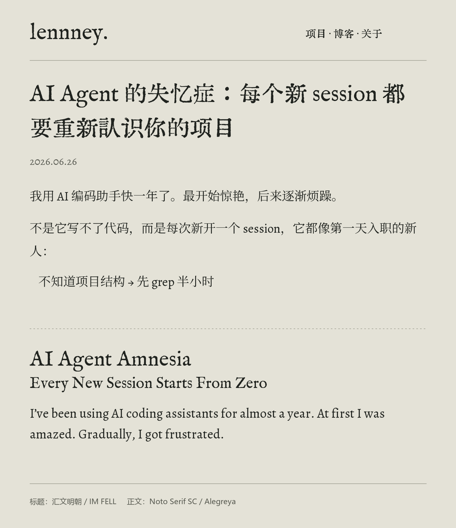
Chinese and English headings and body text, set together for comparison.
I used a separately generated paper texture for the background, with less of it behind long articles than on other pages. Missing ink and chipped edges stay in the illustrations; the text has no noise or blur filter. The night theme uses light text on a dark background with the same typography.
Orange stays on the period in lennney.—the typeface’s own period, with its color changed. It is conspicuous enough there, so I did not repeat the orange accents through the navigation and body.
The deer and crane, then a different bird on mobile
An early paper study put a bird on the left and a short decorative border on the right. Both sides had a graphic, but the forms and their roles differed. I did not accept the combination.
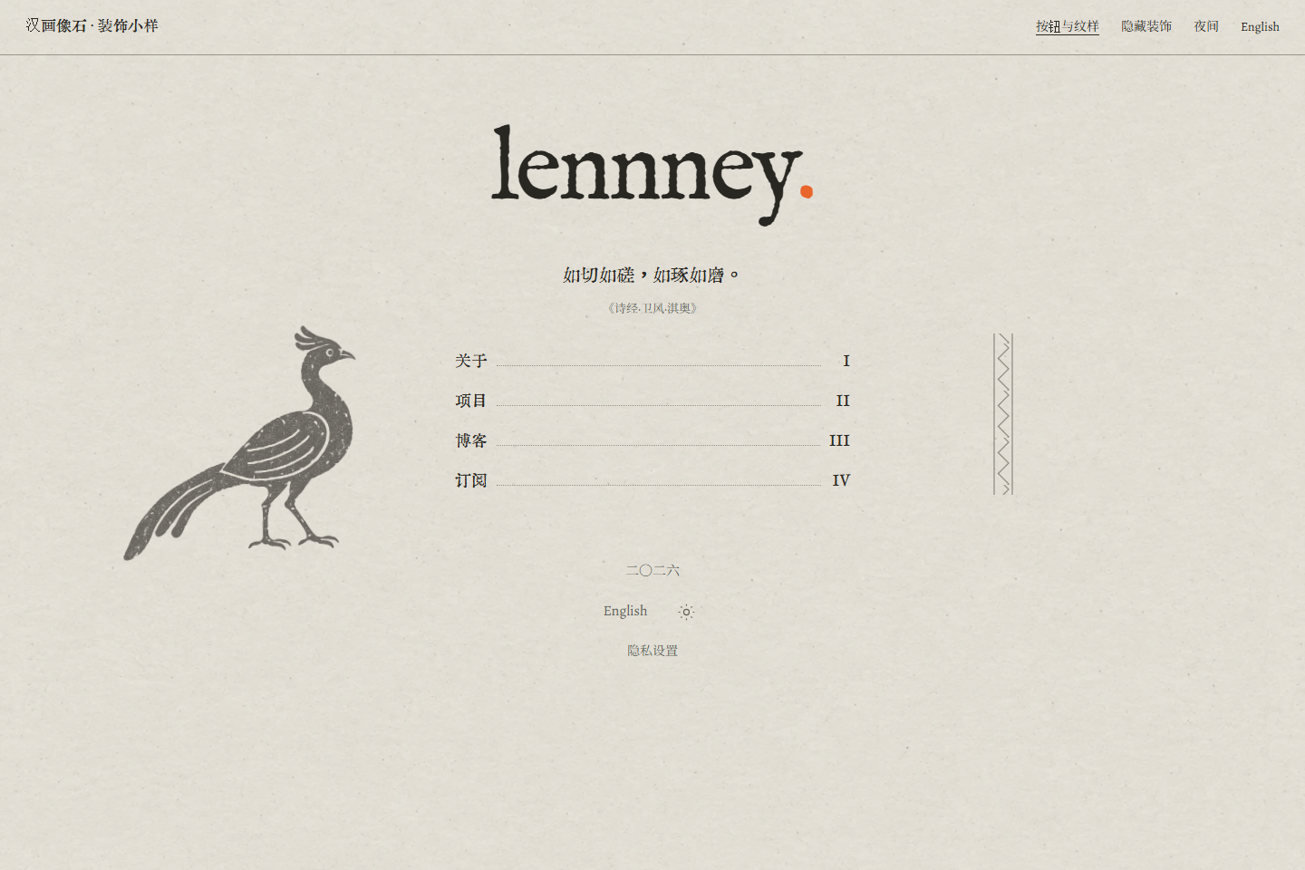
The early bird-and-border composition, when the contents still had four entries.
The desktop homepage later gained a deer on the left and a crane on the right, both facing the contents in the middle. These images draw on rubbings of Han stone reliefs: simple contours, small gaps in the ink, and open areas within the image.
Once the animals were on the page, they needed balancing. The deer has a broad body; the crane is narrow and long-legged. Equal CSS widths did not give them equal visual weight. Their sizes, ink density, and positions were adjusted separately, using the visible forms and where their feet came to rest.
Once the deer and crane were in place on desktop, I had to try the composition again on a phone. Narrow-screen versions hid the side ornaments or placed both animals below the contents. In the end, I replaced them with a different, smaller bird below the links. The wordmark, verse, and three destinations still occupy most of the page.
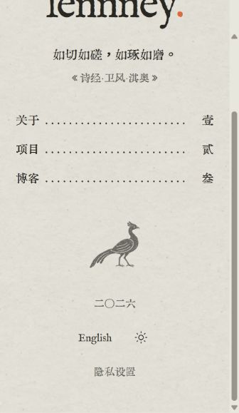
On mobile, a single bird remains beneath the contents.
What does “叁” mean above an article?
After About, I went through the project list, writing list, articles, and guides. The early homepage had a subscription link. Later it kept only About, Work, and Writing, and I decided against building a subscription API. Removing a section meant updating the contents in headers and footers too. I also reviewed return links to reduce repeated navigation.
On the writing list, I looked more closely at the search field, buttons, and messages. Search became a simple underlined field, and actions mostly used text. Search, clearing the field, and empty-result messages remained so readers could see what they could do on the page.
After reviewing the Chinese version, I went through the English pages again. Titles changed length and wrapped differently. Navigation wording, dates, and paragraph rhythm also needed attention. With the English copy in place, I had to look at the layout of the whole page again.
On an article page, I questioned the “叁” at the top. It inherited the number for Writing, the third section. On an individual article, though, it could look like the article’s own number.
I asked for the other pages to be checked on the same basis. Top-level About, Work, and Writing pages keep their chapter numbers: 壹, 贰, 叁 in Chinese and I, II, III in English. Individual articles and project details no longer repeat the section number. Installation steps still use numbers because the steps have an order.
The edge of the image and the edge of the ink
As the pages were settled, I asked for a review using grids in graphic design. Ordinary narrow columns use 436px; long-form reading expands to 640px. Narrow screens retain at least 24px on either side. Pages can use different widths while still giving headings, text, illustrations, and contents clear alignment lines.
The project illustrations exposed a specific problem. Several images had equal canvas sizes and equal spacing below them, yet some looked cramped and others too loose. The transparent areas at the bottom differed. The browser measured the image rectangles; the eye saw the ink inside them.
The images were kept intact, with spacing compensated according to each illustration’s visible lower edge. That made the distance from image to text look consistent. A new illustration also needs to be judged by its own shape, rather than simply receiving the previous image’s values.
Entries in the writing list also needed to change height with their content. Some titles fit on one line; others wrap onto two, with the date flowing beneath them. The gap between title and date stays fixed, while the entry can grow.
These changes went into shared styles and the design records. Later pages could use the column widths, type roles, and spacing relationships, with local adjustments for different content.
Project images need to say something about the project
The engraving phase used different beagle actions to distinguish the projects. In the rubbing-inspired set, each project gained its own scene. BJD has a craftsperson, a supported doll, and a small note. Stop That Shit has a gatekeeper and scrolls. Agent Search has a traveler, branching paths, and distant pavilions. Slim has folded pages unfolding continuously from a case.
To explain how Slim works, the guide gained a flow diagram. It needed to show what happens after a call: how the compact view is delivered, how the full-content snapshot is stored, and how to retrieve the details.
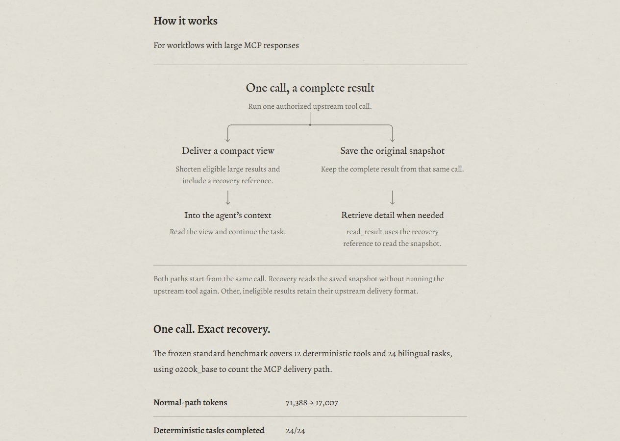
Slim’s workflow diagram uses HTML for the text and inline SVG for the connectors.
The diagram uses the page’s existing type and ink color, with fine rules above and below and space between nodes. Text sits directly on the page; its position and the connectors show the relationships. On wide screens the paths can sit side by side. On narrow screens they are rearranged so the text remains a readable size.
When the same basic components were used for Search and STS, the text hierarchy, lines, and spacing carried over, with a separate flow for each product. A project can use several kinds of image: an illustration for the scene, a diagram for the mechanism, and screenshots for the interface and records.
Putting the agreed choices into code
AI was involved throughout the redesign: generating image candidates, building interactive studies, changing pages, checking screen sizes, and putting confirmed rules into code. I reviewed the results page by page. Many requirements became easier to express once I could see the page: which layout I liked, how much personal information to keep, or whether a chapter number belonged above an article.
The requirements became clearer as I worked through different pages. The writing list had long titles that About did not; the guides had branching relationships absent from the lists. Once an approach worked on several pages, it went into a shared component, with further adjustments as new content came in.
I discussed the technology stack during the process and ultimately kept Next.js static export and MDX. Most changes were to page organization, content, styling, and components. Existing articles remained in the new paper layout.
This version went live on October 3, 2026. The engraving illustrations, dot-matrix experiments, and unused bird-and-border composition remain in the design records, where I can still see what changed between versions.